
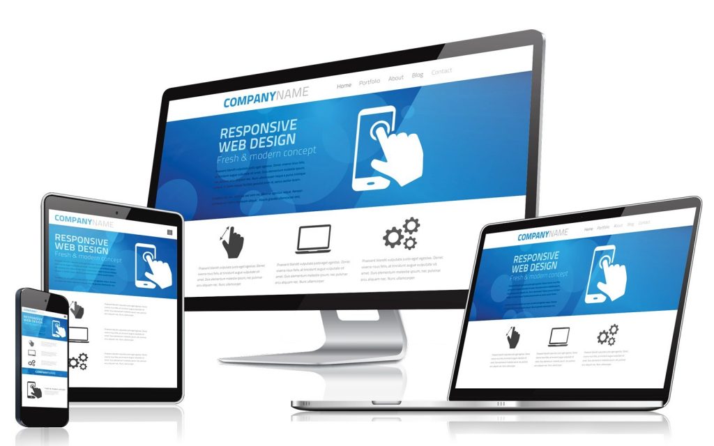
What is responsive web design?
“Adaptive” web design used to be trendy. Each web page would have multiple style sheets, one for each possible type of device. It was messy and ugly, difficult to maintain, and always managed to not work on some devices. It evolved from the practice of tailoring pages to look nice on the author’s screen, and then later adding extra fixes so that it doesn’t look so awful on other people’s.
Many sites still use this terrible method
“Responsive” web design is a much better way of doing things (and frustratingly, for the most part it was available long before people started doing the adaptive thing).
Rather than the web page author attempting to handle all conditions, the layout is defined in ways that allow each user’s web browser to do the most appropriate thing for the current environment.
Most web browsers are quite good at this, despite what the adaptive people seem to think
For instance, an adaptive page might say make this image 100px wide on a smartphone, and 200px wide on a notepad, and 300px wide on a desktop, and so on. Oh, and better set different font-sizes for each device too. And … .
But an adaptive page would say make this image 50% of the width of the window, but not less than 15em (for overall appearance and layout), or say that it should be 30em wide but not more than 100% of the width of the window (for legibility of the image).
The general principle is to never specify sizes in absolute units (px, in, etc.) and always use relative units, “%” for relative to the window or container size, and “em” for relative to the text size.
It’s the way web pages should have been designed from the beginning.